Saturday, September 18, 2010

Mech #4

Today I managed to do a few weapon models for the mechs. The player is supposed to be able to completely customize their mech and this includes the weapons. Once again Kai did up some awesome concepts for us to model from. The concepts for these weapons were great and made it easy to model.

Concept Art:

Fig 1.1) Side View

Fig 1.2) Front View

Modelling these weapons did not take too long. Luckily most of the weapons were kept as a combination of basic shapes which made it easier to model them. This weapons will attach to various weapon points on each mech. 

3D Models:

Fig 2.1) Missile Launchers (4 and 6 pack)

Fig 2.2) Rocket Launcher

Fig 2.3) Rail guns

These models still have to be checked by Gordon, but I am happy with the way they turned out. My modelling skills have definitely improved since the beginning of the year and I think the quality of my work shows this. That is all I have to show for today. As always feel free to comment, constructive criticism is how we learn after all. Thanks for reading.

Friday, September 17, 2010

Run 'n Gun #2

The past couple weeks have had ups and downs. We have nailed down the visual style we want, we are trying to go for a Matt Hazard look, basic shapes and 'semi-realistic' textures. I started modeling and texturing assets for the game and over the past week I have learnt that texturing is not my strong point. So I modeled a couple assets and passed them on to Cameron to edit and texture the way he wanted. Luckily his texturing skills are a lot better than mine which makes things easier on me.

Dan has finished modeling and texturing the main character and it seems to have turned out according to what the group wanted. So I have been given the task of rigging and animating the character. The hero needs a few various animations assigned to it, run, sprint, shoot, jump, fall and death animations to be specific.

But before I can animate it I had to rig and skin the character. Finally I got to attempt to rig a full human character. I had some problems rigging the arms in order for them to bend right but managed to fix this problem. The scene was looking really messy so in order to correct this I made groups for everything, mesh, rig, controllers and IKHandles. This made things easier to find and select. I had problems with getting the orientation of the arm controllers to match with the joints, but found a solution by moving the joints and model into a straight line which helped get everything oriented the same way.I found that rigging and setting up controllers for the upper body is a lot more complicated than for the lower body.

Rigging:
Fig 1.1) Rig and Controller Setup

Fig 1.2) Character with Controllers

The character is skinned, but I have not yet weighted it correctly. First I will create a short animation to test the rig in-game and make sure it works. If this goes well then I will start to correct the weighting and animate the character further. If everything goes according to plan I should be able to start animating the character later this week.

We a planning on using motion capture as well as keyframe animation for this project. I so I will be checking with my motion capture teacher on Monday to make sure this rig setup will work properly in Motion Builder. For the next couple weeks I will be going through tutorials and getting to grips with Motion Builder as an animation and motion capture tool. In the mean time I will be using 'placeholder' animation (probably keyframed) until we can get into the motion capture studio (I believe we will be in the studio within the next couple weeks).

That's all I have got for you today. Planning on getting some more work done this weekend and hopefully get ahead of schedule for once. As always feel free to leave any comments or even words of encouragement if you'd like. Thanks for reading.

Mech #3

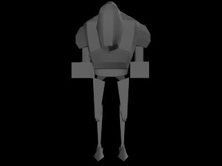
This week I carried on with modelling, rigging and animating another mech. Kai had already done up a few concepts and we all chose which one we wanted to try complete. I chose a rather strangely structure mech, the legs remind me of a pair of bird legs. Once again I modelled, rigged and animated this mech.

The concept art for this mech was once again great, it is really great having a concept artist like Kai.

Concept Art:
Fig 1.1) Front and Side View

I had to change up a thing here and there to get the model in 3d to look and 'feel' right. I had to make changes for some of the joints to get them to look functional. After discussing it with Gordon, I also decided I would leave the legs straight instead of bringing the feet closer together like in the concept.

3D Models:

Fig 2.1) Front View

Fig 2.2) Side View

Fig 2.3) Perspective View

I have started to get use to rigging now, especially for legs. I managed to rig this mech very quickly and easily compared to the rest. I did a pretty basic leg setup, a joint for each rotational point and an IKhandle from the hip to ankle. Again, I did not have to rig the upper body of this mech as it will rotate according to the player. The only down side to this rig setup is that I don't have as much control over the rotational amounts of the bones in-between the hip and ankle.

Rigging:

Fig 3.1) Rig Setup

With this rig setup it was easier to animate than I thought it would be. I still have to check with Gordan if he is pleased with the movement this rig setup allows. I am pleased with the result I have achieved although I think there is room for improvement.

Animation:


That is it the last mech I will be doing for now. I will be moving on to do a few weapon models and hopefully get them ready for this next week.

As always, thanks for reading and feel free to comment (or criticize if you really must). Thanks.

Monday, September 13, 2010

Mech #2

I have been given a second mech to work on. Dan Deppe had already modeled it from another one of Kai's concepts, so I just had to rig and animate it. I had some trouble figuring out a way to rig it to get decent results due to the legs being an awkward design, but with some help from Dan we managed to find a easy solution. We decided to rig the legs just like a normal pair of human legs and just skin the sections of legs to the right joints. This worked out great and was a lot easy than we thought.

Rig and Controllers
Fig 1) Rig and controller setup

Animation
Animation 1) Walk cycle

Animating this mech was great as well, I didn't have any problems with it. I managed to get a decent walk cycle going in no time and Gordon was really surprised and happy with the result. This was a great confidence booster for me as well. It showed me that I actually know what I am doing when it comes to animation and am heading in the right direction to becoming an game animator.

Sunday, September 12, 2010

Mech #1

So over the past couple weeks I have been working on a top secret Mech game. I cant really say much about the game itself, but this is what I can tell you. The player can join one of two teams of mechs. The mechs are fully customizable from body parts to weapons. And the last thing I can say is that you get to blow things up. To sum it up, it's going to be one awesome mech game!

I have been given the tasks of modeling, rigging and animating the mechs. I have been modeling the mechs according to Kai Hulme's concept art which has been great and makes life a lot easier. I had to tweak a couple things from the concepts to get the model to look right and functional in 3D.

Concept Art:
Fig 1.1) Front and Side View

Fig 1.2) Perspective View


3D Models:

Fig 2.1) Front View

Fig 2.2) Side View

Fig 2.3) Perspective View
This project has also given me a chance to learn how to rig models and set up controllers. The rigging is very basic so it makes is less intimidating and gives me a great learning curve and foundation to get to know the process and steps involved. Since the only part of the mech that has to be animated for now is the legs, it makes things a lot easier to deal with. Basically I have got a joint for every pivot where the mech's legs can rotate. The mech I have been working on has human like legs so rigging it was simple, a joint for the waist, hips/thighs, knees, ankles and foot with and IKhandle attached from the hip to ankle. This is like most biped rigs are set up.

Rigging:

Fig 3.1) Rig Setup

Using this rig, I have animated a walk cycle for this mech. This is the first bit of animation I've gotten the chance to do for the year. I had to be careful with how much I moved the legs because I didn't want and clipping to happen. I had a problem where the knees of the mech would snap just after the foot hit the ground and managed to solve this by shortening the stride of the walk. I think I managed to get a pleasing result for this walk cycle.

Animation:
Animation 1.1) Walk Cycle

And that's it for now. I believe I have achieved the desired result and I am pleased with my effort. Feel free to leave any comments or constructive criticism, thanks.

Monday, August 23, 2010

Run 'n Gun #1

For now I have been assigned a role in asset development for our run 'n gun side-scroller. I have modeled a few buildings that will be used to create the world of this game. I have modeled these buildings in a modular way so they can be re-used to create bigger/longer buildings. They can also be textured in many different ways to create even more variety.

We are going to be trying a new method of level design that we haven't done before. I am sure it is a common practice in a lot of games so we are going to experiment with it as well and see how it turns out. We are going to be modeling everything separate from each other, windows, doors and buildings will be separate items and 'stitched' together to create even more variety to the environment. Hopefully this way we can make the game look and feel great.

Here are a couple screenshots of some of the work I have done for now.


Suspended Platforms:


Doors of Different Sizes:


Building Modules:


So what do you think of the work so far? I know it doesn't look like much right now, but we have high hopes for this game and really want to make it great. So your opinions and comments would be greatly appreciated.

Thanks.

Sunday, August 22, 2010

New Beginnings

It's time to put everything I learnt last semester to good use. In the last post I mentioned it's a new semester, which means a new game. At the moment I am working on a side-scrolling run 'n gun style game.

Basically the player plays as Agent Hank Malone and he is out to rescue Secret Agent Princess. The story will be your typical shoot up the bad guys and save the pretty lady(who doesn't like saving her) from the evil villain. The player will have a large assortment of weapons to use to create havoc and kill anyone standing in the way. The player will be able to run, jump and shoot, for now that is all the actions that can be performed.

Currently we have two levels in mind. The first starts out in a train yard where the player has to work their way through the hordes of enemy attacks to get to the next level. At the end of the level there will be a Boss Battle (still to be decided) and then on to the next level. The second level will be a little trickier. The player climbs aboard a moving train and has to make their way to the front of the train without being killed by enemies or falling off the train. There will be carriages the player will have to jump onto roof by roof or climb into and walk through the carriage. Once the player gets to the end, there will be another boss battle. Defeat this boss and save the girl.

That's the new game in a nutshell. Really looking forward to working on this game. Hoping I'll get to do more animation that last semester, which I think I will. I'll keep you posted on our work through-out the semester.

Saturday, August 21, 2010

I'm Back

So, it has been a while since my last post and with a new semester comes new posting.

Before my break I was working on a zombie RTS/tower defense, needless to say it was quite the adventure. Unfortunately we ran out of time and had to butcher out a lot of our intended features and the game turned out to be a tower defense game with absolutely no RTS elements to it. This made it just like every other tower defense game out there. But it was still an experience and I definitely learnt a lot from it.

I think the most important thing I learnt from Zombies would be SCOPE. Have a realistic scope for any project you are working on, especially if you have limited time, skills and experience. It doesn't help having one coder (who did a fantastic job) trying to code the whole game either.

Not to mention having two or three artist without any direction to a specific art style. This leads me to the second thing I learnt. Make a DESIGN DOCUMENT for the whole team to follow. This should contain game features the coders have to create to the look and feel of game assets for artists. In other words everything that has to do with the game. The clearer everyone's understanding about the game, the better.

Now I could go on and on about everything else I learnt and write a book about it, but I think I'll leave it for now.

Have you been involved in any projects that didn't go according to plan? Feel free to sure your experience right here.

Wednesday, June 16, 2010

Personal Work


I found this rig here and chose to use it as my game character for this semester until I rig up my own character. Here are a few animations I have worked on recently.


Walk Cycle:


Run Cycle:


Jump:


These are the playblasts of some of the animation cycles and actions I have been doing. This is my first attempt at making animations for games specifically, and I feel like it is a good starting point. Over time I hope to learn a lot more and increase my skills to a professional level. For this reason please feel free to add any comments or advise, it would be much appreciated.

Zombies Final Stage

It has been a while since I last updated everyone with what is going on with Zombies. Basically we have decided to go more in the direction of a Tower Defense style game-play with Real Time Strategy (RTS) elements.

The player has to defend hordes of zombies from getting to the base in the center of the city. The player has the choice to either freely move soldiers around the environment or use a soldier to build towers in certain places on the map. The game is over once the zombies destroy the base.

A few changes have been made to get the game to its current state. The first major change is the artificial intelligence (AI) of the units and zombies. We were having probably with the AI working properly in our environment. The zombies and units could not navigate through the city to get to the target locations. The method we were using was also extremely expensive framerate wise causing the game to slow down drastically. We solved this problem by implementing a node based movement system for the zombies. For the soldiers we decided to go the route of point and click, with the soldiers moving in a straight line from point A to point B. Although changing the way the soldiers moved around the environment made it slightly harder for the player we felt it was the best option. After implementing this new AI we saw an amazing improvement in the framerate, this gave us the option of having a lot more zombies on the screen.

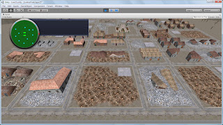
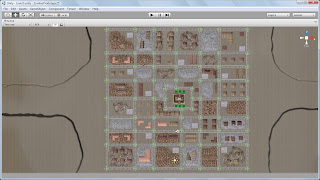
Game Environment:

(The green circles are where nodes are located)


With the improvement in framerate due to the new AI system we were also able to create a much larger environment(can be seen above).

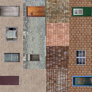
For our environment we wanted to create a large enough area for the player to defend against but at the same time keeping it small enough so not to make the game-play too easy for the player. With this in mind we thought of the best way to do this using as little resources as possible. We decided that we would use a few basic, generic models and texture palettes to get various looks from the same models.

Texture Palette 1:


Texture Palette 2:


With these texture palettes we managed to create many variations of buildings from the same models(shown below).

Building Variations:


Where Zombies is now I hear you ask?Well, I would say Zombies is still in a prototyping phase. We have the ground work there and working, it just has to be worked on and improved a bit more to make it a better game.

Zombies has turned out to be a massive challenge and headache. We encountered many problems and dealt with them accordingly. It has definitely been one hell of a learning experience.

Wednesday, May 19, 2010

Visual Feedback

Today I did up a few elements for visual feedback and the HUD. This should be implemented for the next milestone of Zombies. With the visual feedback implemented it will make the game a lot more user friendly and enjoyable. Here are a few of the feedback images I did up.


HUD Layout with space for the radar:


Button Templates (There will be images of each objects instead of letters):


Soldier Selected Icon (will be at the base of the selected soldiers):


Move Here (When the user selects a location for the soldiers to move towards this icon will be placed):


Death (When the zombies or Soldiers die this will be placed):


At the moment I am happy with all the icons and HUD, except for the death icon. I think the death feedback should actually be a 3d object in the game to give it depth and then it could sink into the ground over time. We will just use this death image as a placeholder for now.

So that is what I have done for visual feedback for now. Please feel free to add any feedback or comments. Thanks for reading.

Tuesday, May 18, 2010

Zombies Milestone

So over the past week or so we have been working more on our Zombie game. We have made improvements with the code and the visuals. Everything seems to slowly be coming together.

We now have a full working and adjustable radar. The soldiers can now get through the walls but the zombies have to break it before they can go past. The AI has been improved as well. We now have multiple spawning points and a day/night system is in development. And I think that's it for the code at the moment.
As for visuals, we have started texturing buildings and assets. We are using texture palettes to do all the texturing, that way we can make a few variants of the same buildings and it wont look repeated (that's the plan). We also have animation for the zombies walk, only one at the moment but we are planning on having a number of different walks just for some difference so the zombies don't all just look the same.

Here is a screenshot:


Zombies Update

This is an update for the Zombies game I have been working on with a group of friends. We have actually added a few features since I last updated the blog so thought I'd get to it.
Changes:
1) zombies can break through walls
2) walls take time to build
3) AI is starting to come together a lot better
4) zombies move towards the target area (will be the HQ) unless soldiers get close to them and then they attack the soldiers
5) A radar has been implemented
So those are changes we managed to get done two weeks ago.

Here is a quick screen shot of all these changes:


Monday, April 19, 2010

Buildings Again

I did up a couple more buildings a few weeks ago and just didn't get around to putting them up on the blog. I decided I would put screenshots up for them today.

So here they are.

Building 01.


Building 02.


Wednesday, April 14, 2010

Various Assets for Zombies RTS

Over the last couple weeks I have been working on a few street/road assets for the Zombies RTS game I have been doing with a few friends. I haven't done as much as I would have liked to due to the fact that I have been doing some work for my personal portfolio as well (hopefully get a demo of my rough work up in the next week or so). Also managed to get a generic skeleton rig which will be used for the zombies and soldiers animation. I've been trying out some different animation techniques (including Mo-cap) and am really enjoying it.

Here are a couple screen grabs of what I have done so far.


Random Road Assets:


Bench:


Generic Character Rig:


And lastly here is a first attempt at Mo-cap. Its just a walk cycle.

Short video of Mo-cap attempt 1:


And that's it for now. Feel free to leave in comments and suggestions. Thanks for reading.

Wednesday, March 31, 2010

More Zombies Work

This week I have been doing some basic environment work. I've managed to get a full low-poly building modeled as well as a destructed version. I'm still busy working on another building which isn't finished just yet. I also managed to get a town map so now we can actually plan the layout of everything and have a better idea of what buildings and assets are needed. For now we are concentrating on the buildings and trying to get a decent quantity for a city. We will probably move on to building assets in a few weeks, once we are happy with the way the city looks.

Here are a few screen shots of my work.

Town Layout:


Building 01(Destroyed)


Building 01(Normal)


That's it for now. Feel free to comment if you have any advice or ideas.

Thanks.

Wednesday, March 24, 2010

Textures

So, I've finished all the textures for the models I showed the other day. Now bare in mind that these are for a prototype, so I haven't gone into too much detail and kept it very simple.

Here are the textures.

Figure 1. Wall texture


Figure 2. Random building 01 texture


Figure 3. Random building 02 texture


Figure 4. Destroyed building texture


Figure 5. Barracks texture


Figure 6. Terrain texture


And that's all the textures for now. Feel free to leave any comments you have.

Thanks.